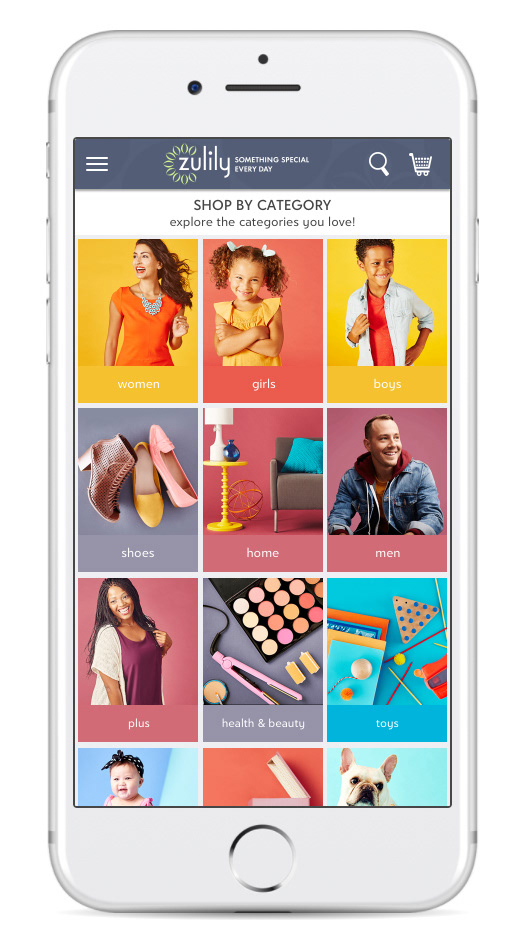
shop by category
UX Direction: Strategy, project management, user testing support
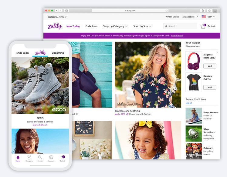
To better serve customers looking for specific items, as opposed to browsing, we created a shop-by-category experience to bring Zulily into the modern age of online shopping. We took a mobile-first approach and innovated beyond what we saw competitors doing at the time.
targeted shopping
A long-held belief at Zulily is that customers are primarily browsing the site and apps to discover the unexpected—things they don't even know they need. While this is true most of the time, it's flawed to think those same customers don't sometimes want to find something specific and browse in a more targeted way. For these "spear fishers" as our CEO liked to call them, we were not serving them very well.
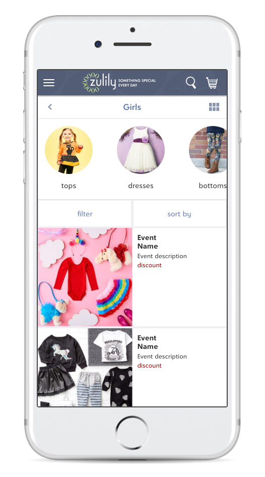
A common complaint we saw in our user testing was that customers felt overwhelmed by the wall of sales events—an uncategorized grid of 100+ image-based tiles that seemingly went on forever. When customers did find their way to the "Shop by Category" section, we watched them struggle to find a specific item because the categories were limited and very broad (e.g. just "Women", no sub-categories) and still showed results by sales event, rather than by product. We were making customers work too hard, jumping in and out of events that may or may not have the type of products they were seeking. When customers tried searching, they were often disappointed with the results due to limitations with our search engine.
The UX team partnered with Product Management, Data Science and Marketing to better understand the opportunity for improvement here—both from a customer experience and business perspective.
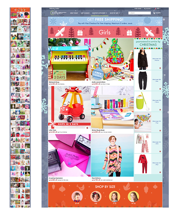

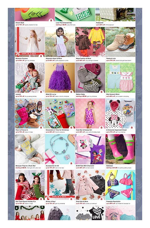
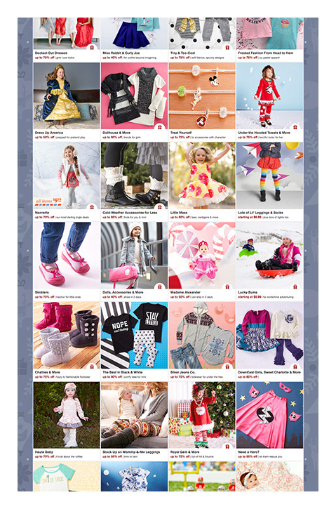
A "Girls" category page before my team redesigned the experience. Each image in the grid represents a different sales event that contains hundreds of products. The larger screenshots combined only show HALF the sales events that actually appeared on this page (shown in the teeny-tiny screenshot, left).
the challenge
We knew customers would benefit from a re-envisioned experience, even if we only did the bare minimum of what online shoppers expect: to be able to filter and sort by a number of attributes to hone in on the products they want. However, we wanted to go above and beyond a typical faceted search experience and strike the right balance between feeling fun and being functional.
Another challenge we faced was resistance to changing the status quo for fear of hurting business revenue. Some of our stakeholders were convinced that giving customers better tools for targeted shopping would take away from event-based sales and "discovery shopping". Various attempts to improve shopping by category in the past had not tested well so there was understandable concern here.

How might we allow customers to quickly find products they are looking for in a way that makes shopping fun, and increases conversion?

the process
Competitive analysis: 6 sites and apps on mobile for what works well, what doesn't
Wireframes: explorations for different navigation models, filtering, sorting, promoting seasonal content and more
Interactive prototypes: to test with users and share our vision with business partners
User testing: multiple rounds of online testing and iteration
Visual design: multiple rounds of refinement to incorporate feedback from user testing, exec and stakeholder reviews


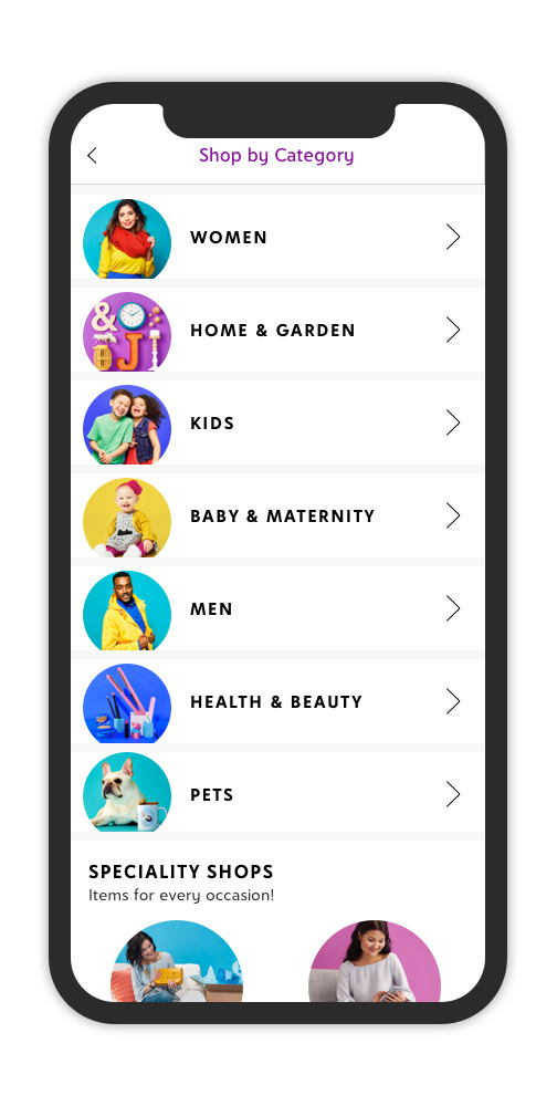
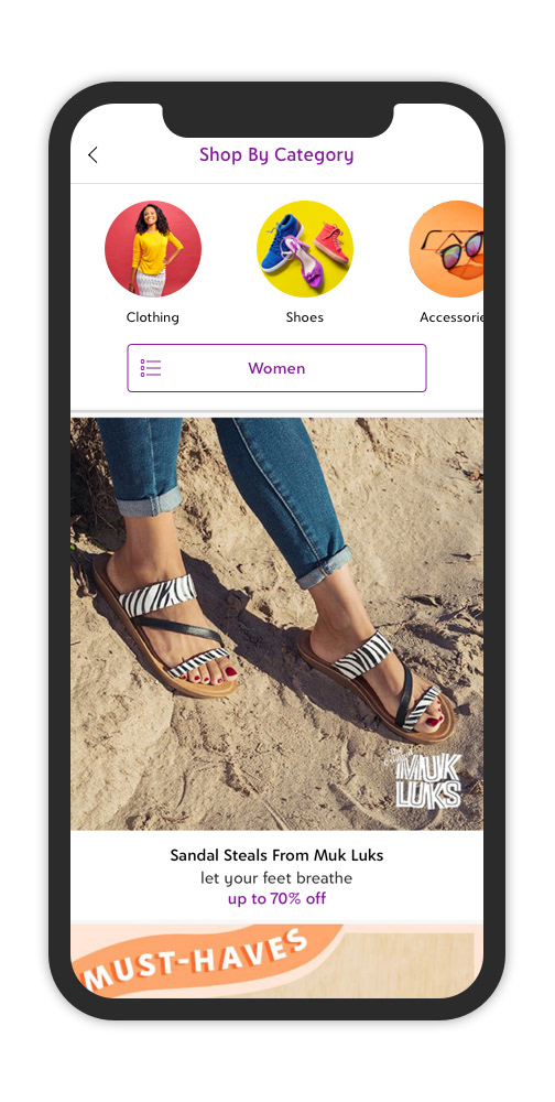
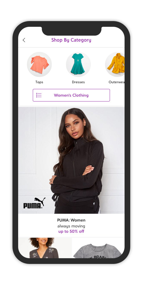
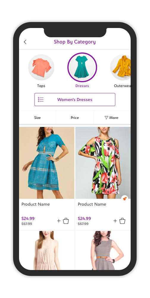
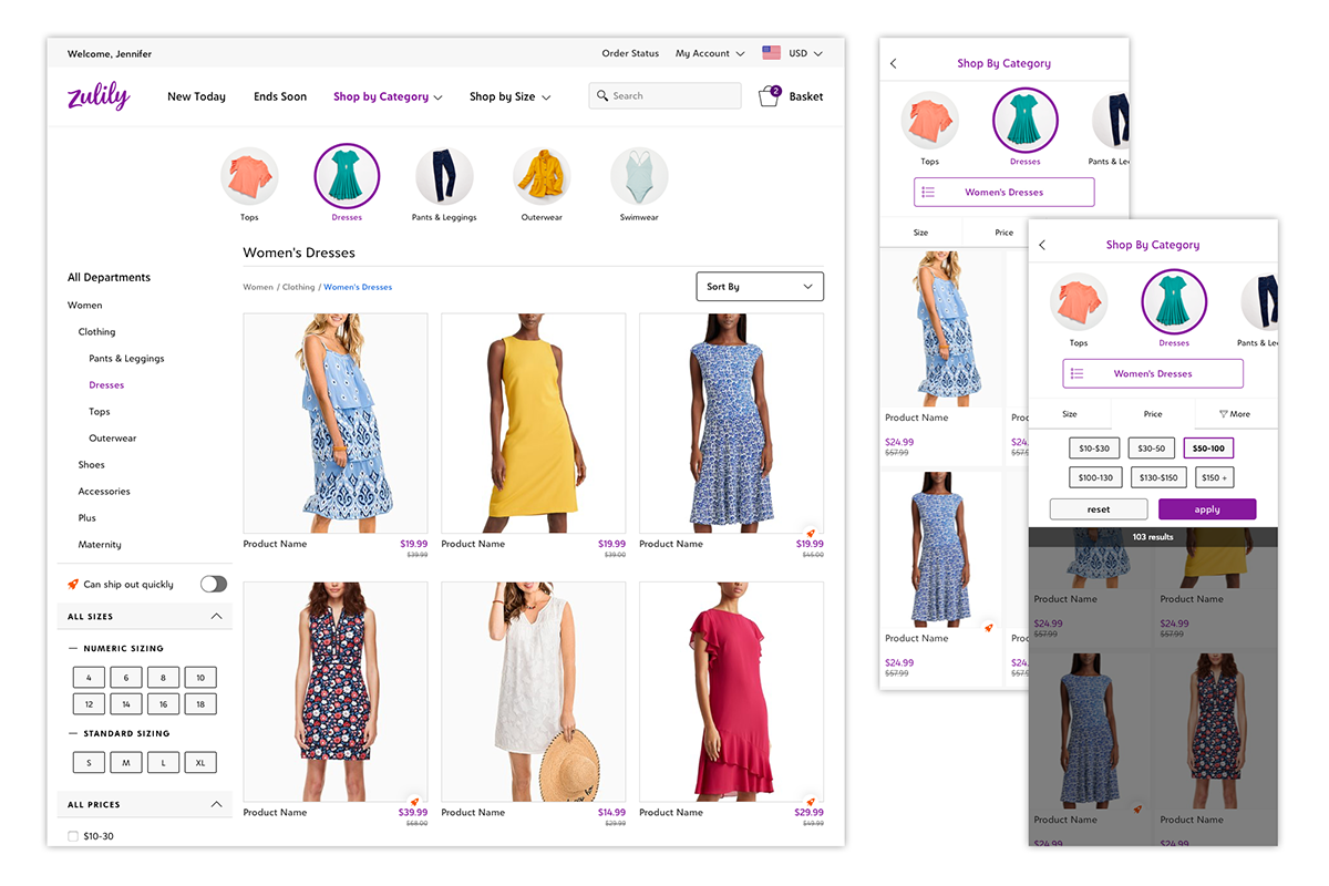
Final designs for top-level, tier 1, tier 2 and tier 3 pages.
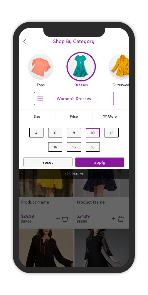
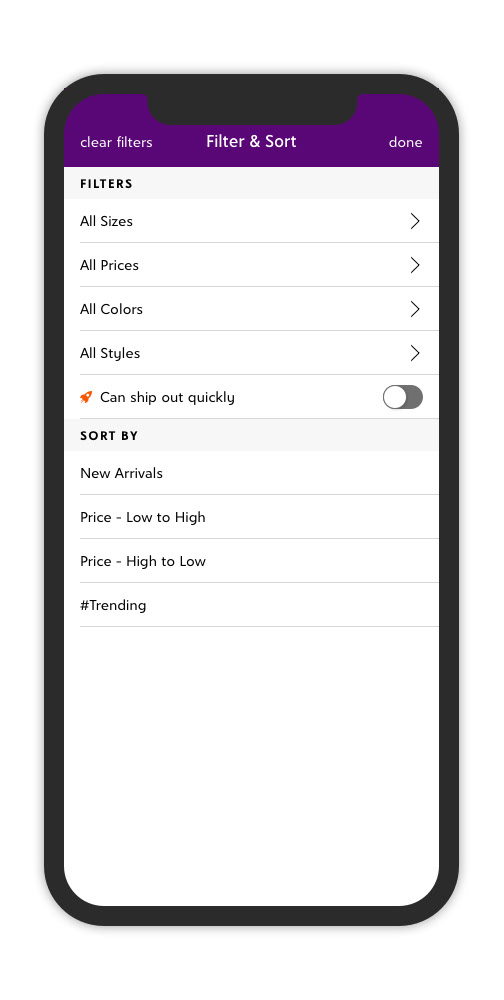
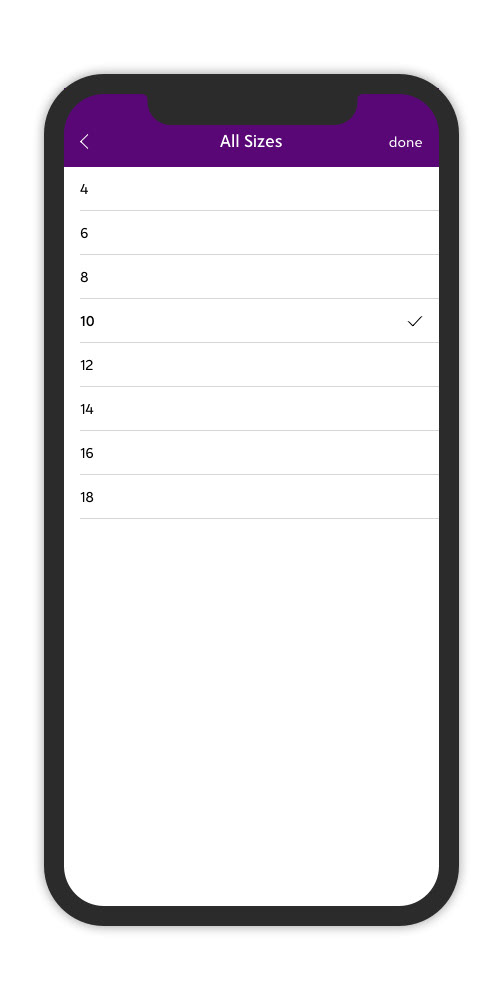
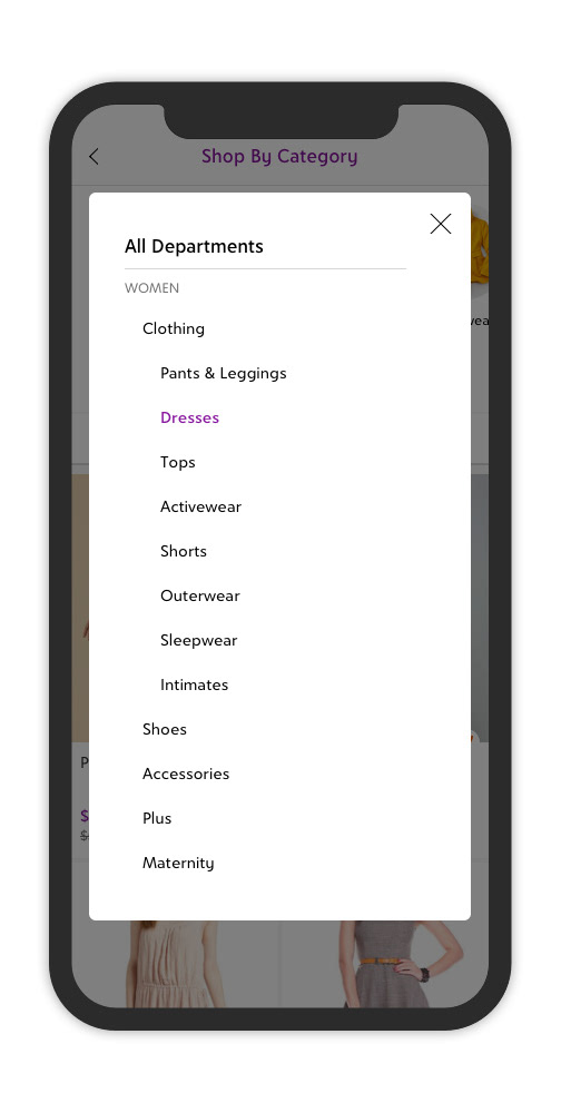
Quick filters, "More" filter sheet (iOS experience shown) and navigation tree from "Women's Dresses" button.
Design Lead: Adam Anderson, designer and UX pro extraordinaire
the results
The new experience had not launched before I left Zulily, but we had very positive signals from customers during our user testing, and data on our current experience showed a promising trend for those who did use categories for more targeted shopping. Here are high-level findings from 3 rounds of testing with a total of 16 participants:
Image-based navigation was intuitive and visually appealing
Quick filters for size and price were easily discoverable and usable
Participants successfully applied filters within the “more” button
Several participants commented on how much they liked being able to filter by style, color and other attributes
Category button was initially missed in v1 of test. By v3, all 6 participants discovered the tree menu to jump to a different category
the team
UX Design Lead (2019) – Adam Anderson
Preliminary UX Design (2018) – Rose Hesse