site and mobile refresh
UX Direction: Strategy, project definition & tracking, facilitate working sessions, team assignments & workload, user testing support, design principles workshop

The end result, after countless hours and lots of passionate discussions on corner radius of buttons, just what exactly IS a segmented control and why "daybreak blue" for text would be a casualty of ADA compliance.
time for a rebrand
When online retailer Zulily launched its website in 2010, “Mom” was the target persona seeking items in apparel, maternity and baby gear. A decade later, Zulily customers are still mostly women (95%) but a large percentage are not moms and they shop a much broader range of categories—Home, Men, Garden, Electronics and more. Shopping behavior has also shifted from desktop to mobile, where over 70% of purchases are made today.
As Zulily’s product offering expanded and its customer base changed over time, the company wanted to redesign the logo in 2018 to better reflect its customers, give the brand a new look and make the logo more mobile-friendly. Research revealed that customers were drawn to Zulily for a “fun shopping” experience, as opposed to routine shopping for things like everyday household goods. And so a new customer profile emerged that was centered around discovery-based shopping and the thrill of finding something unexpected at a great price. Additional insights from this research laid the foundation for a new logo and updated brand pillars: to be playful, energized, confident and inclusive.

The old logo + tagline from 2010 - 2018

New logo + tagline 2019 - present
the challenge
My team faced the daunting task of updating Zulily’s responsive site and mobile apps to incorporate the new brand identity in 12 weeks, even while color palette, logo and usage guidelines were still being finalized. This may seem straightforward in an organization with a design system, styles and standards already in place. Just tweak the CSS right?? (This was repeated multiple times by Marketing execs.) But no, not at Zulily. There was no design system. The CSS framework was a mess due to many, many devs and designers over the years reinventing things like buttons. Just take a gander at said reinventions below.
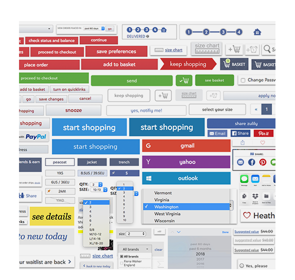
Before: chaos and inconsistency
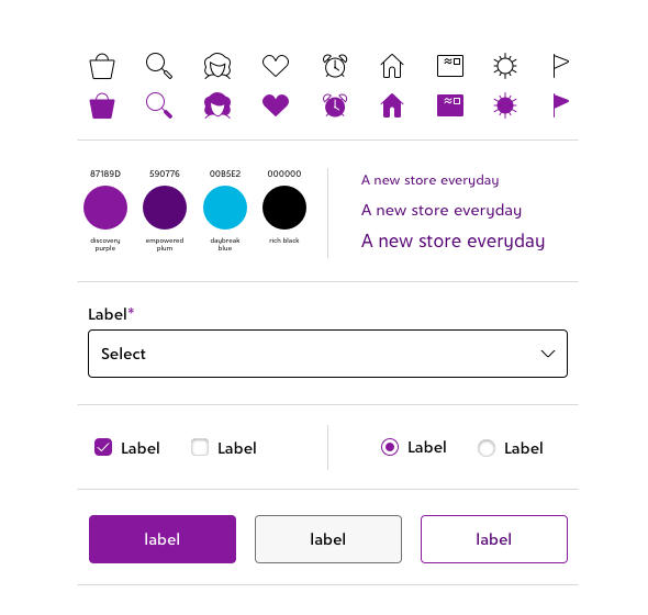
After: unified system of icons, UI, color and typography
The brand refresh offered us the opportunity to change all that. And so, we approached this as the first phase of a much-needed redesign, laying the foundation for a design system at Zulily. We knew the engineers would be touching every page of the site and apps for iOS and Android. And they also wanted to make the code architecture more flexible to accommodate components that come and go or change over time.
To help realize this vision, one of our team goals was to create a consistent system of UI elements, components and behaviors to bring cohesion to our cross-platform ecosystem.

Before: The old site felt very dated, busy and heavy.
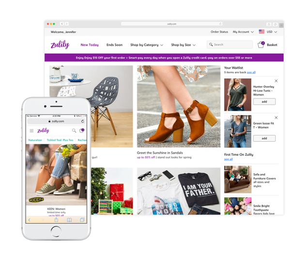
After: Ahhh...A fresh, new experience for customers.
the process
In order to meet the company's ambitious timeline and the business goals of our partners in Product and Marketing, I helped lead a small but mighty team of 4 UX designers through a rigorous process that involved:
Current-state audit of responsive website, iOS and Android apps for UI and interaction patterns
Defining our core, common elements, behaviors and patterns
Updating styles for all UI elements, typography and content to reflect the new brand
Designing in Sketch: hundreds of high-fidelity design mock-ups across three platforms; symbol libraries save the day!
UX Design Principles: I led the team in a workshop and drafted 6 principles to guide future work
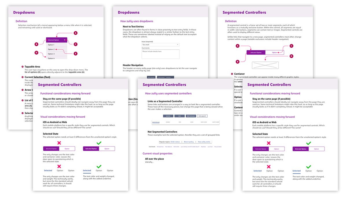
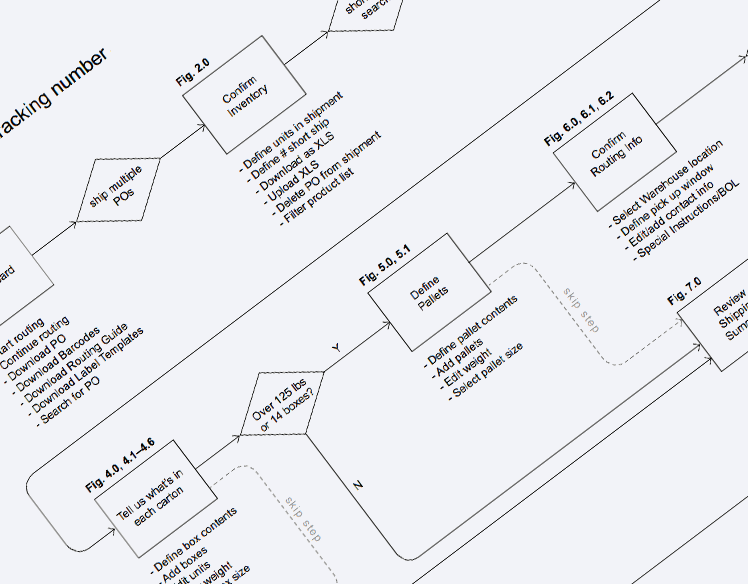
From our "definition" phase. We met 2 times a week to make sense of the variation in UI components/behaviors we came across during our audit of the site and apps. These are a few pages that came out of that work.
Credit: documentation from the amazing brain of Adam Anderson.
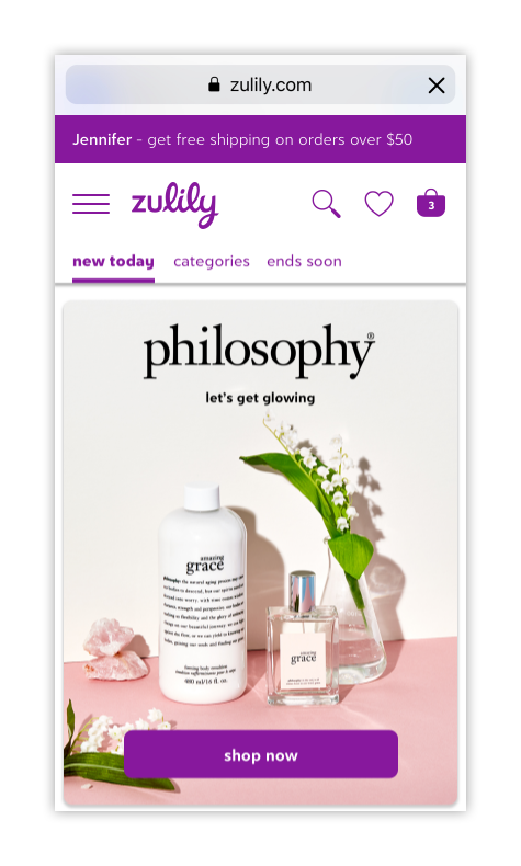
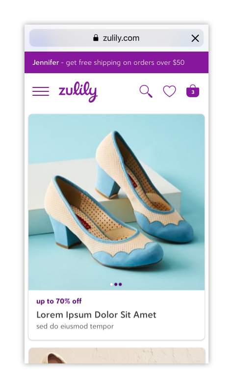
An early redesign exploration to envision what a future version of zulily.com might look like on mobile.
Design Lead: the incredibly talented Mykal Murphree.
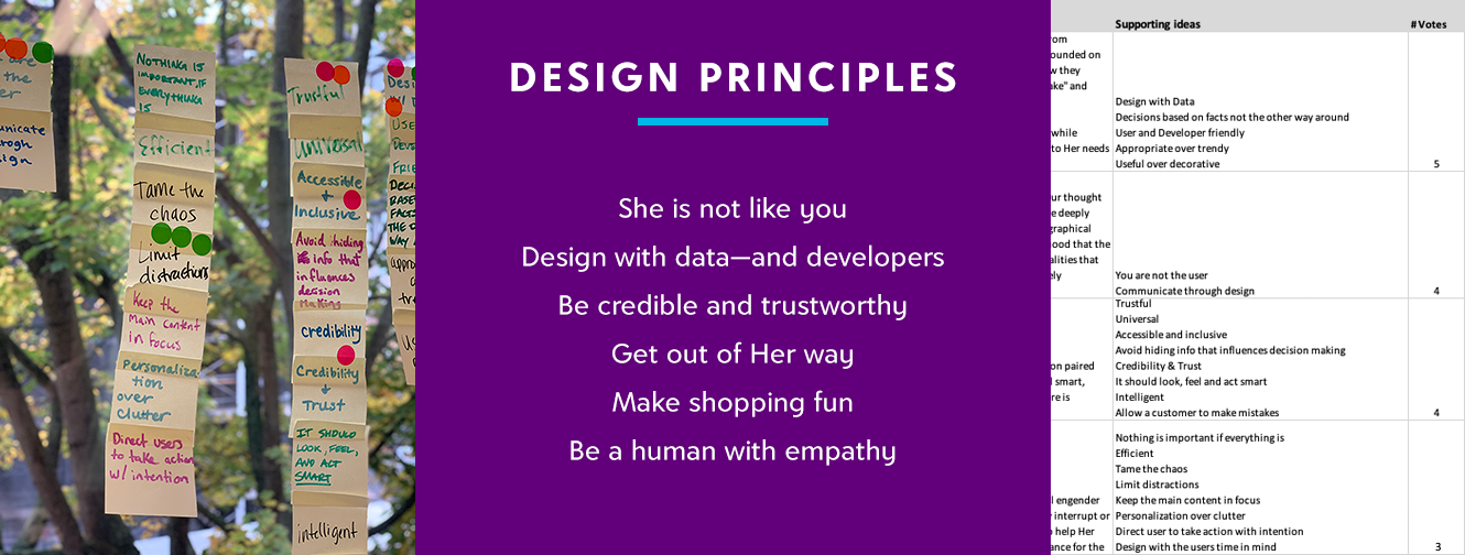
Design Principles: I led my team in a workshop, collated notes and drafted 6 principles to guide future work.
the results
More cohesive, consistent and clear experience for customers—especially as they move from desktop to mobile
Faster load times and easier code updates due to use of SVGs for icons and UI elements
Increased design/dev efficiencies: quicker, more flexible design/build cycles, better documentation, shared vocabulary and a single source of truth with our new design system
Increased UX team efficiencies as we now have Sketch files and symbol libraries for everything on the site and apps that are easily updated and maintained
Greater consistency throughout Zulily creative teams due to well-documented standards and UX Style Guide
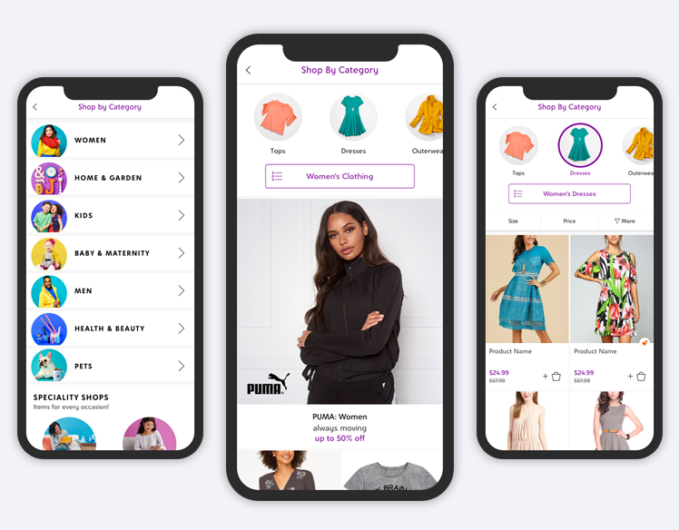
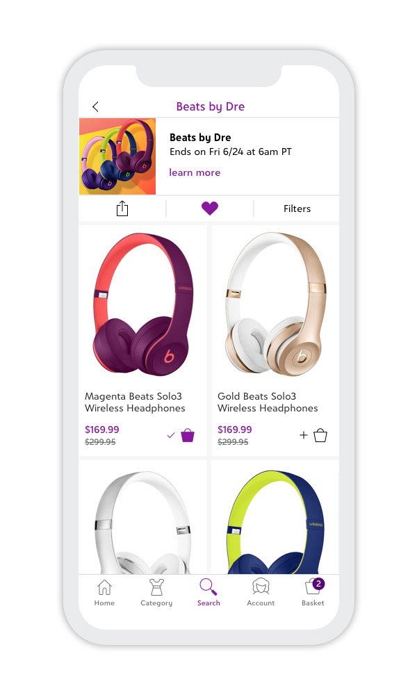
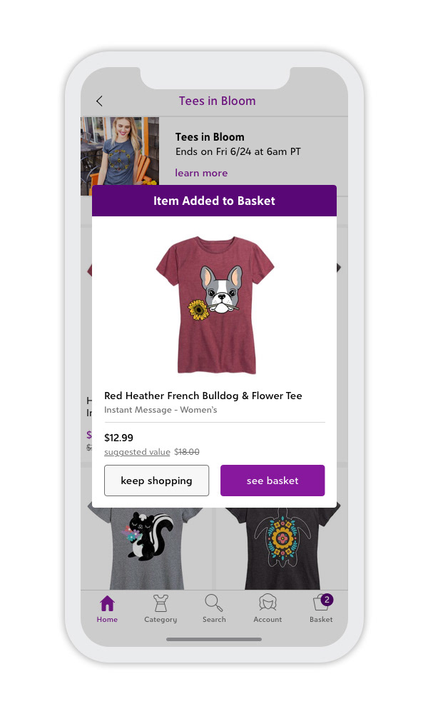
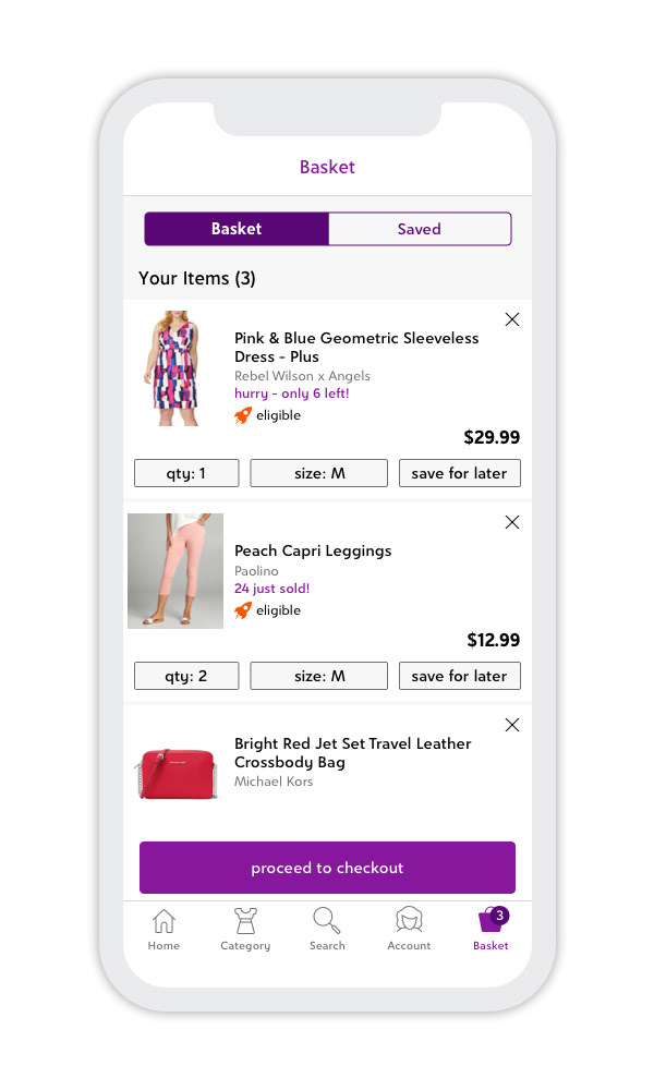
mobile app for iOS
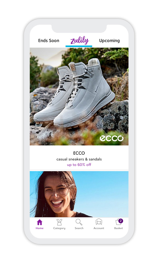


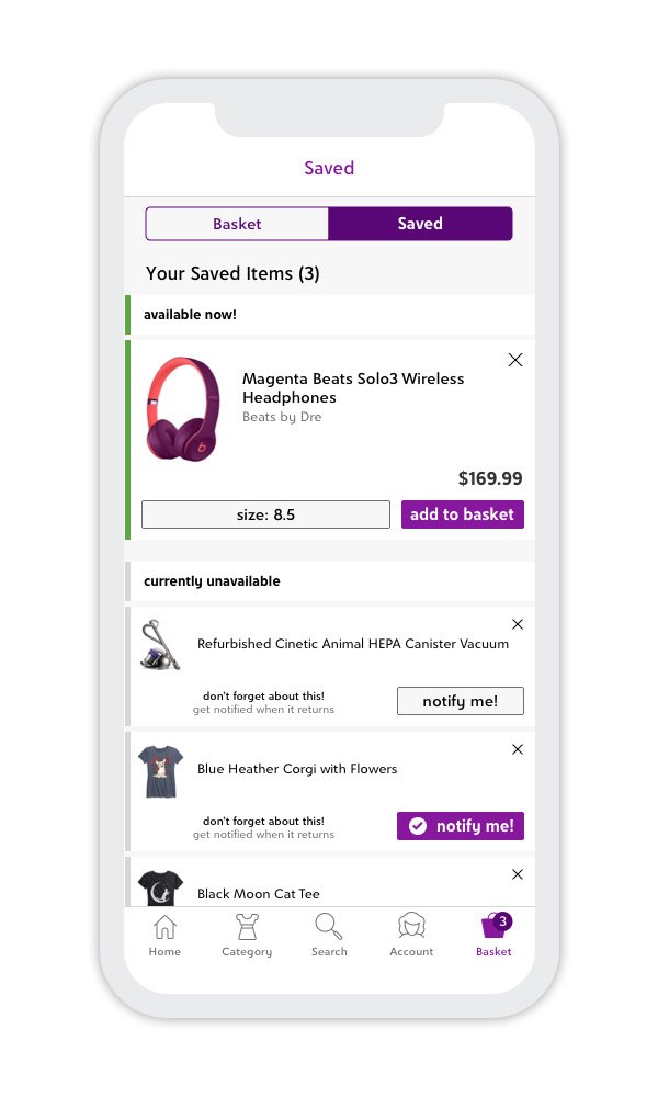
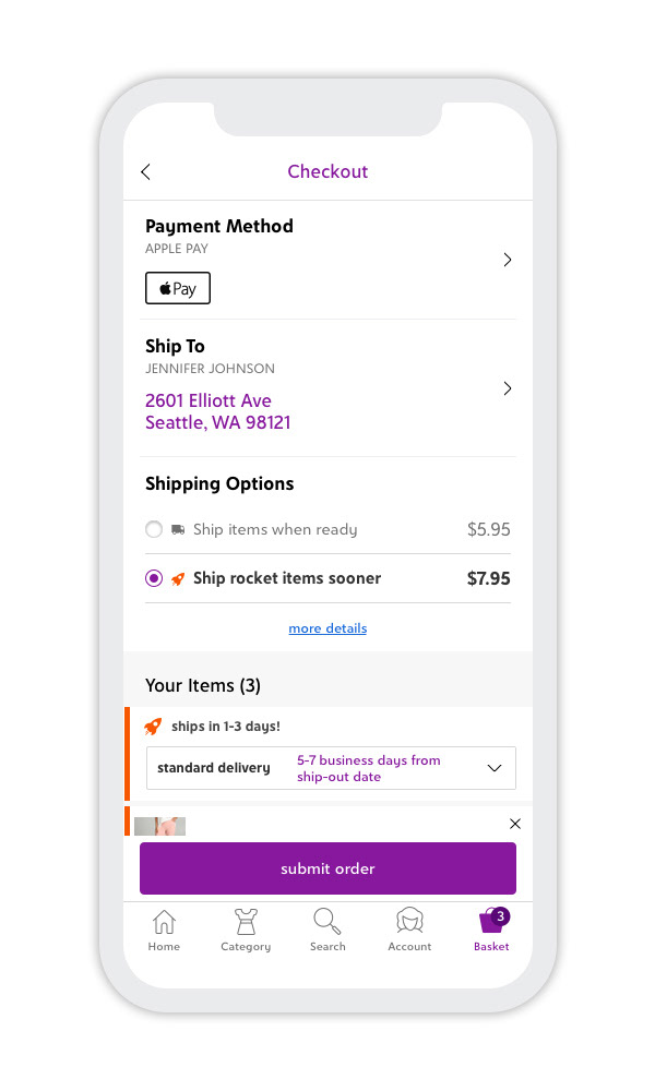
responsive site
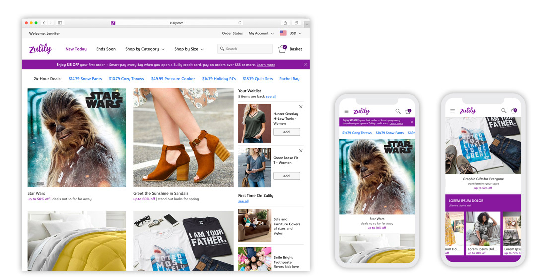
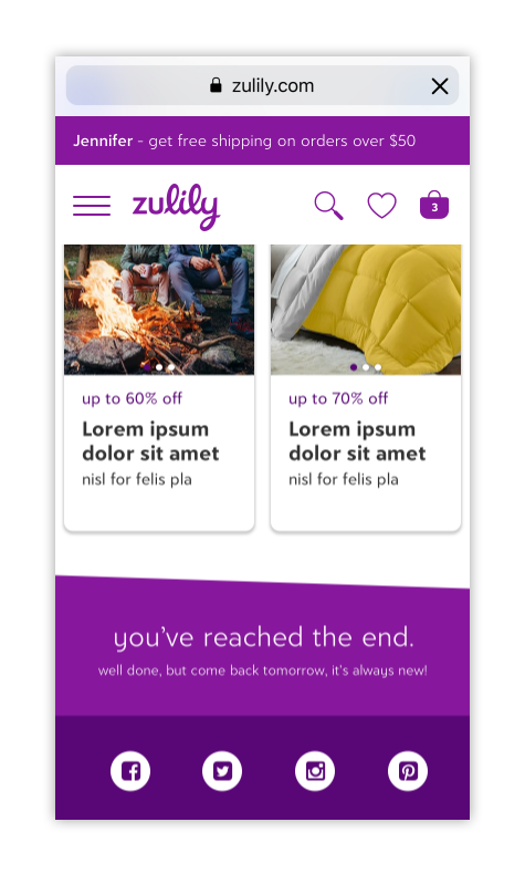
Home page - desktop and mobile web (scrolled view on right)
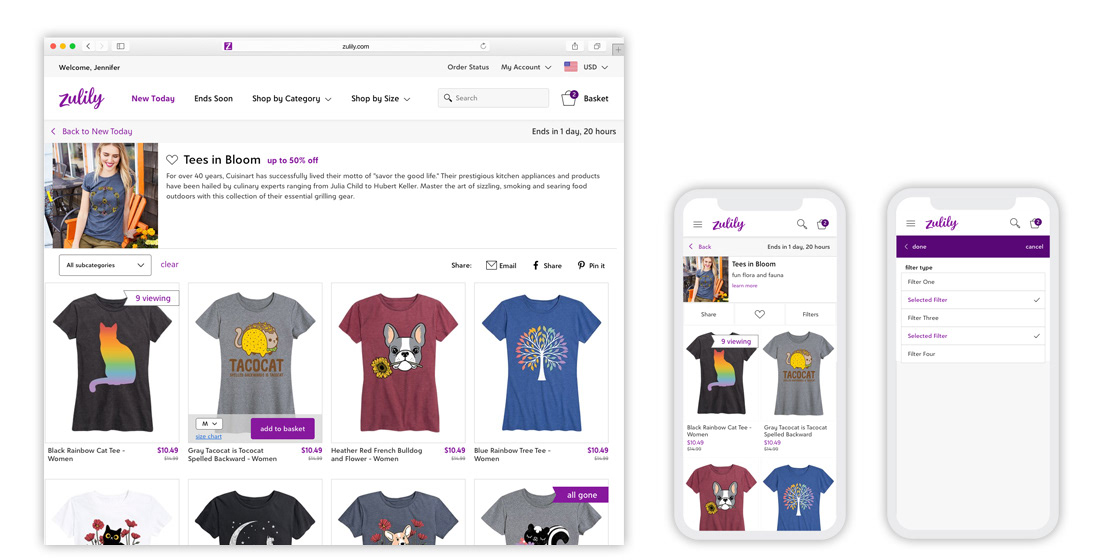
Event page - desktop and mobile web. We updated the filter experience (right) to be mobile-friendly and consistent with our mobile apps. YES!!
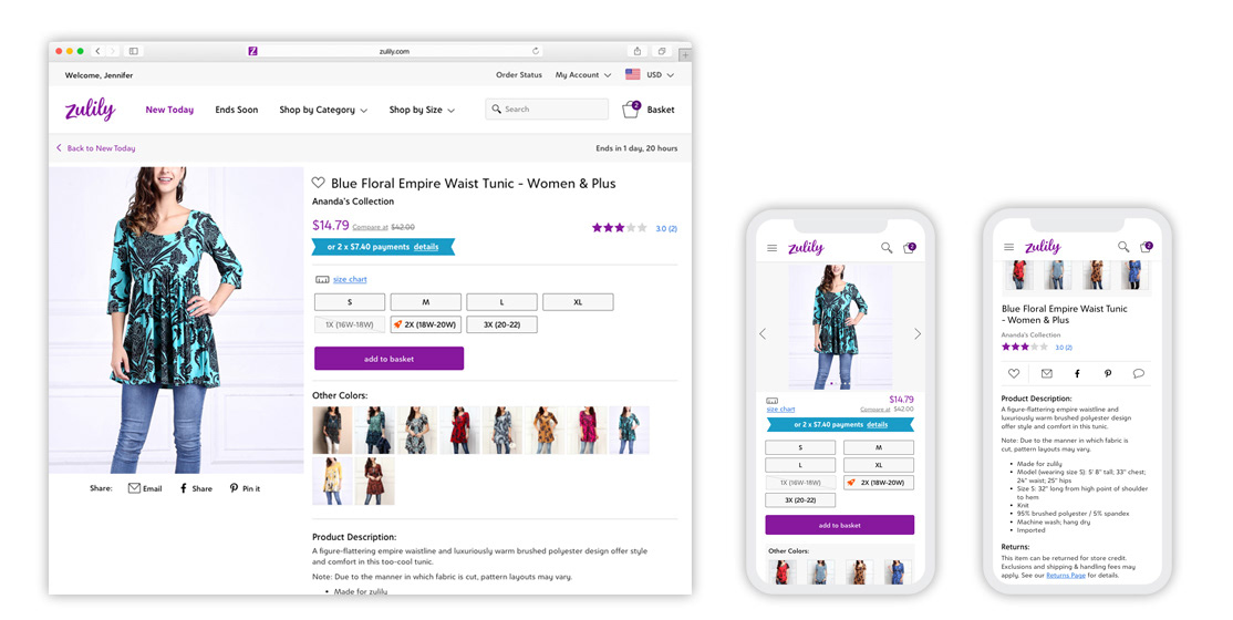
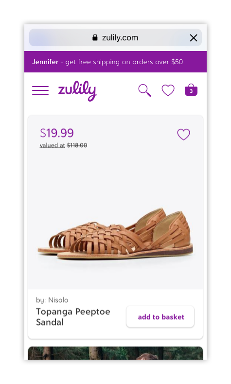
Product page - desktop and mobile web (scrolled view on right). Featuring one of the most popular items sold on Zulily—a tunic! We manufacture and sell gazillions of them.
the team
UX Design Lead – Mykal Murphree
UX Design – Mizuho Tanaka, Adam Anderson and Mallory Jamison